Free Delivery
 365-Day Returns
 10 Million Happy Customers
 500,000 Products in Stock
Top Interior Colour Trends for 2027
Reviewed by the Beliani Content Team · Updated September 2026
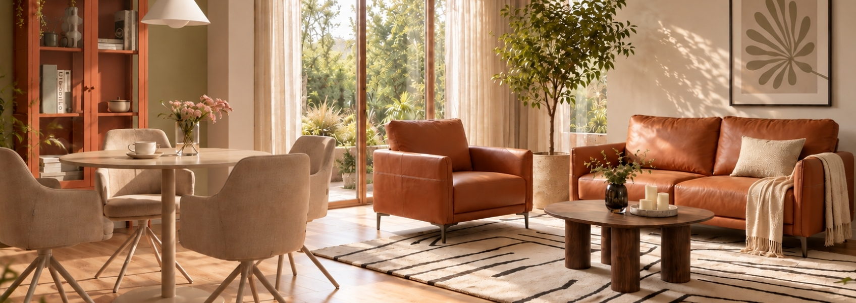
Interior colour has been quiet for a while, dominated by cool greys and washed-out neutrals that ask very little of a room. The forecasts for 2027 mark a clear turn away from that, with warmth, depth and a stronger sense of personality coming back into how people choose colour at home. This guide sets out the directions worth knowing before you plan your next room.
In short
What are the top interior colour trends for 2027?
The main 2027 forecasters agree on a shift from cool minimalism towards warmth, but each names a different lead colour. Together, four directions stand out: a statement luminous blue, warm earthy neutrals such as terracotta and ochre, deep plum and aubergine tones, and a grounded, nourishing green.
- A statement luminous blue has been named this year's leading colour of the year by industry forecasters
- Sherwin-Williams builds its "Rewild" forecast around earthy reds and deep plum
- Pantone's Home + Interiors forecast centres on warmth and calm across seven palettes
Why are colour trends turning warmer for 2027?
Three groups publish the colour forecasts the design industry works from each year. WGSN and Coloro are a trend-forecasting agency and its colour-matching partner, used across fashion, retail and interior design to predict shifts before they reach shops and showrooms; for 2027 they name luminous blue as colour of the year. Sherwin-Williams and Pantone, both already familiar names in paint and design, publish their own separate forecasts. Despite naming different lead colours, all three point in the same direction: away from the cool, understated palettes that have dominated recent years.
Design surveys back this up, with a majority of designers reporting that cool, blue-toned grey is losing favour as the default neutral. In its place, warmer, earthier tones are being used as the main backdrop colour rather than as an occasional accent.
Luminous blue: the standout colour of 2027
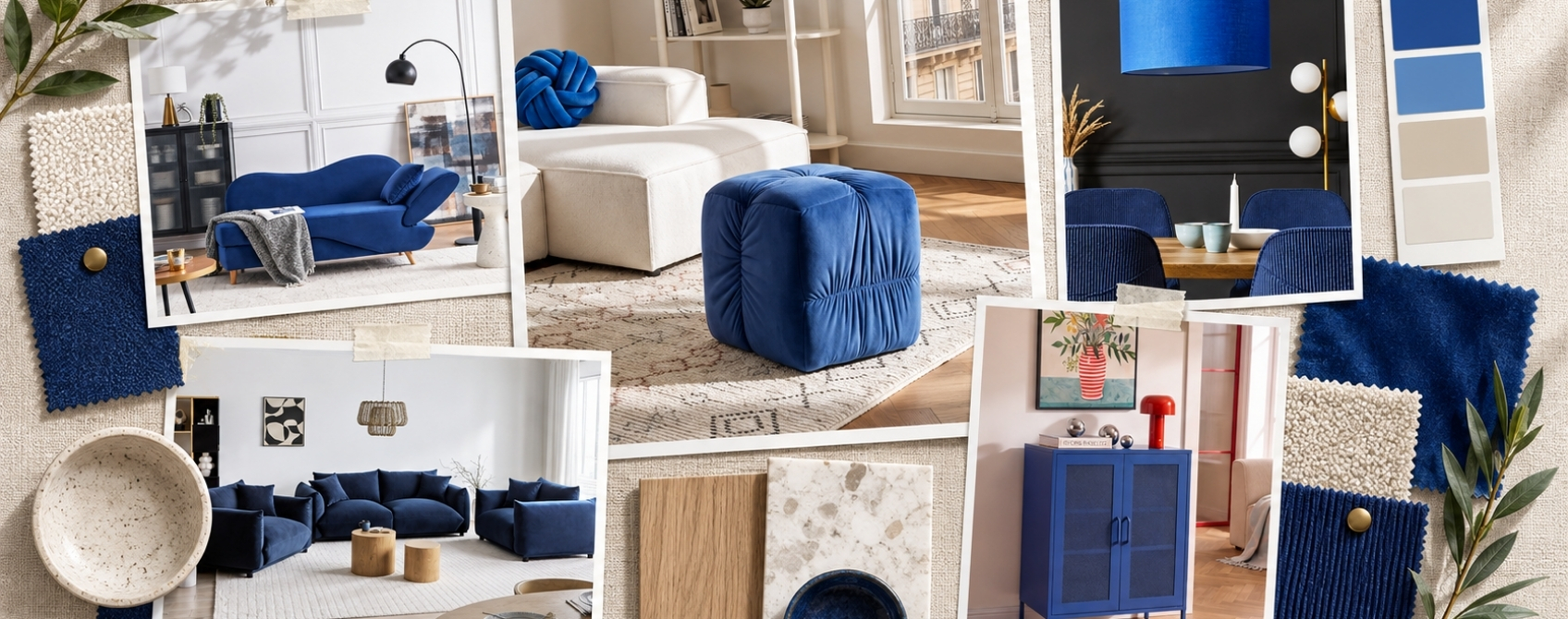
WGSN and Coloro have named luminous blue their colour of the year for 2027. It is a confident, electric, sapphire-adjacent blue, closer to lapis or indigo than to navy or powder blue, and it is intended to read as a genuine focal point rather than a safe background choice.
Because of its intensity, luminous blue works best as a statement rather than a whole-room wash. A single upholstered piece, such as a sofa or an armchair, carries the colour well when paired with warm white walls, natural wood tones and brass or unlacquered bronze hardware.
Shop now: more products in shades of blue
Warm earthy neutrals are replacing cool grey
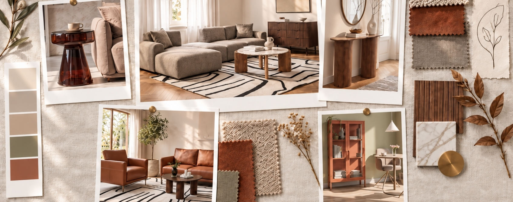
Terracotta, ochre, warm brown and khaki are re-emerging as base neutrals for 2027, taking over the role that cool grey has held for the past decade. These tones read as calm and grounding rather than flat, and they hold their warmth under both daylight and artificial light.
Ochre works well as a backdrop for darker accessories or, used in cushions and throws, as a warm accent against a paler wall. Deeper browns such as chestnut or cinnamon suit rooms with natural materials, including wood, wicker and jute, and pair comfortably with olive or khaki green accents.
Shop now: more products in shades of beige
Deep plum and aubergine bring back depth
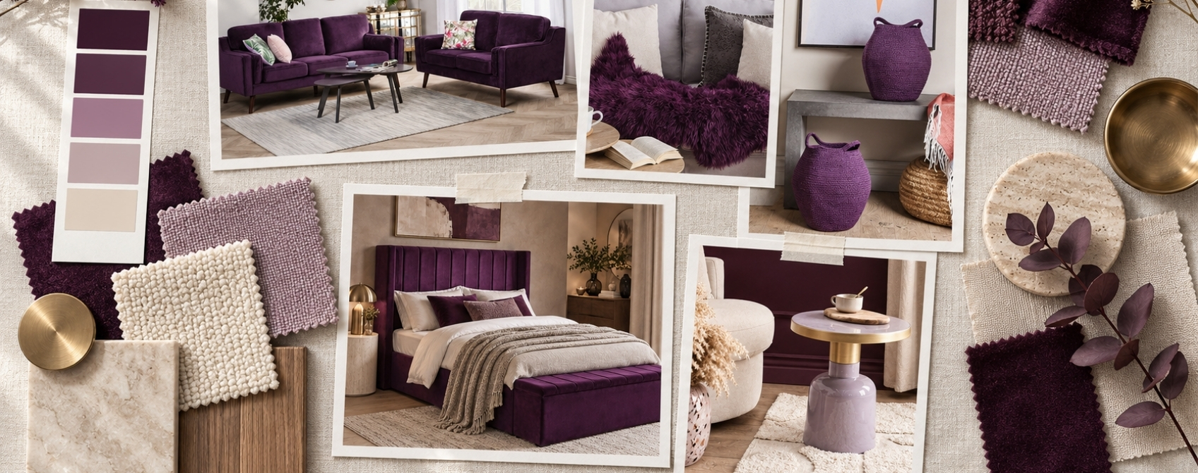
Purple is returning to interiors for 2027, spanning soft, muted mauve through to deep aubergine and fig tones. Sherwin-Williams' 2027 forecast anchors part of its palette in a similarly deep plum, positioning it as a moody, confident alternative to black or charcoal for cabinetry and smaller accent surfaces.
Muted mauve suits small spaces and cabinetry precisely because it carries the same depth as a darker plum without feeling as heavy. In a living room, a plum or aubergine accent chair or cushion set works well against warm neutral walls rather than against another saturated colour.
Shop now: more products in shades of purple and violet
Grounded green continues its rise
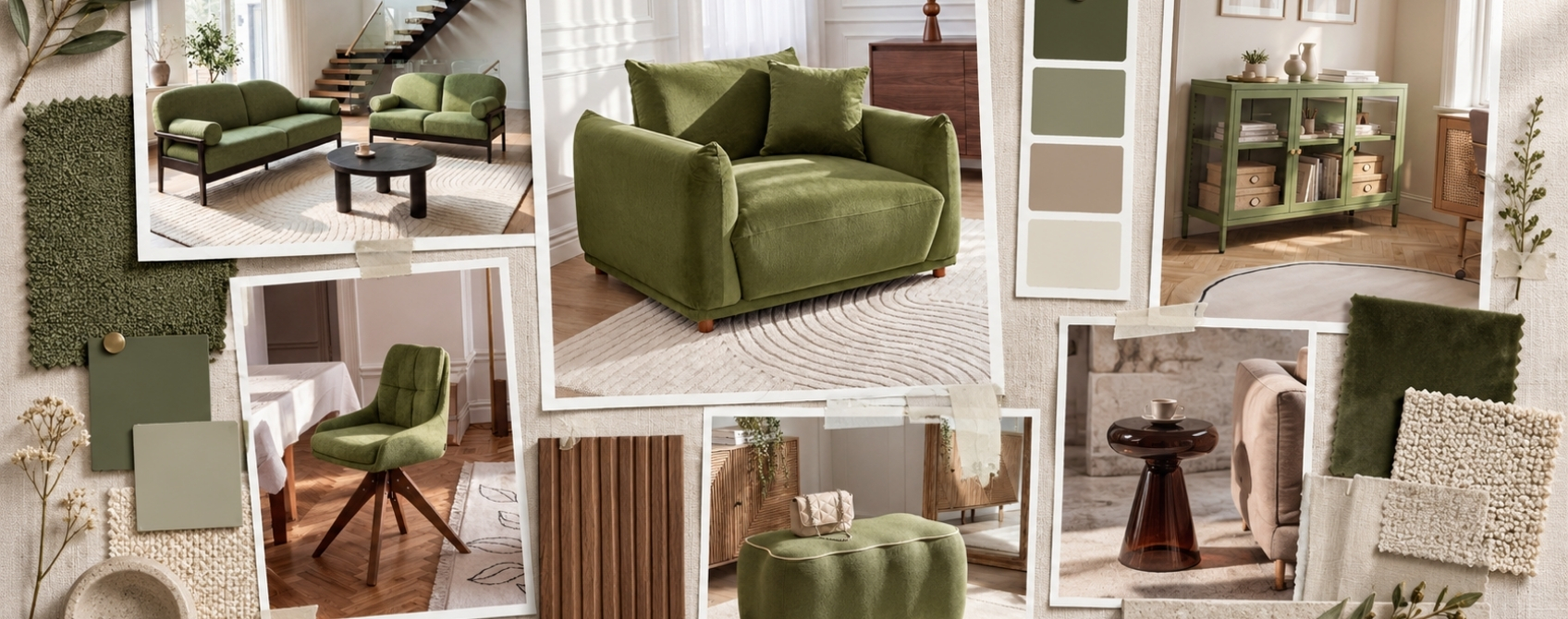
Green has been building through interiors for several years, moving from moody botanical shades to the olive-and-sage tones of the mid-2020s. For 2027, WGSN and Coloro forecast a nourishing mid-green sitting between forest and sage, intended to feel restful rather than dominant.
This kind of green works as a wall colour in a living room or study, since it is calming enough for a space where people spend long periods of time, and it sits comfortably alongside both warm neutrals and darker wood tones.
Shop now: more products in shades of green
Comparing the four leading 2027 colour directions
| Colour direction | Closest everyday reference | Mood it creates | Best used for |
|---|---|---|---|
| Luminous blue | Sapphire or lapis lazuli | Confident, energetic, a genuine focal point | One statement piece, such as a sofa or chair |
| Warm earthy neutrals | Terracotta clay, dried ochre | Calm, grounding, warm rather than flat | Walls, rugs and the room's overall base colour |
| Deep plum and aubergine | Ripe fig, aubergine skin | Moody, rich, a softer alternative to black | Cabinetry, small spaces and single accent pieces |
| Grounded green | Sage leaf, forest moss | Restful, natural, easy to live with | Living rooms, studies and reading spaces |
How much of a room should carry the colour?
Small room or limited daylight
Keep a warm neutral as the majority colour
Use terracotta, ochre or warm brown across walls, floor or the main sofa, and limit a bolder colour like plum or luminous blue to a single cushion, throw or small accessory. This keeps the room feeling open while still carrying the trend.
Larger room with good natural light
Commit one full piece to the colour
A room with enough daylight can support one large item, such as a sofa in luminous blue or an armchair in deep plum, without feeling closed in. Keep the surrounding walls and floor in a warm neutral so that piece stays the clear focal point.
Bringing 2027 colours into your home without a full redecoration
None of these directions require repainting a whole room to see the effect. Textiles are the fastest way to test a colour, since they can be replaced later without touching walls or furniture. A rug in a warm earthy tone, a set of scatter cushions in plum, or a throw in grounded green all bring the trend into a room within an afternoon.
Wall art and decorative accessories work the same way for luminous blue, which is intense enough that most rooms only need it in one or two places rather than across a whole wall.
Shop now: wall art and frames and vases
What to check before committing to a 2027 colour
Before choosing a colour for walls or a large piece of furniture, work through the practical checks below.
- Natural light in the room, since deep tones like plum or luminous blue read very differently in a north-facing space than a south-facing one
- Room size, since bold colours generally work best as an accent rather than a full wash in a small space
- Existing wood tones and metal finishes in the room, to make sure a new colour sits comfortably alongside them
- Whether the piece can be swapped later, since textiles carry less commitment than paint or upholstery
- How the colour looks under both daylight and evening lighting before finalising a full-wall decision
Read more: interior trends 2027
Frequently asked questions
Is grey still a popular interior colour for 2027?
Cool, blue-toned grey is fading as a default neutral for 2027. Forecasters point to warmer, earthier neutrals such as terracotta, ochre and warm brown taking its place as the main backdrop colour.
Is cashmere a trending interior colour right now?
Yes, cashmere has been one of this year's most popular warm neutrals, largely through the "cashmere kitchen" trend of soft, tonal cabinetry paired with natural stone and warm metals. It sits within the same warm-neutral family as the 2027 palette above, rather than as a separate direction.
Which 2027 colour works best in a small room?
Warm earthy neutrals such as terracotta or khaki work best as a backdrop in small rooms, since they add warmth without closing the space in. Save deeper tones like plum or luminous blue for accents rather than full walls.
Do all colour forecasters agree on the same 2027 trends?
Not exactly, but the major 2027 forecasts from WGSN and Coloro, Sherwin-Williams and Pantone all converge on the same broader direction: warmth, natural tones and colour with more depth than the minimal, cool-toned schemes of recent years.
Can luminous blue and warm earthy neutrals be used in the same room?
Yes, they pair well because the warmth of terracotta, ochre or brown balances the saturation of a statement blue. Use the neutral as the dominant tone and bring in blue through a smaller number of pieces.
Has Pantone announced its official colour of the year for 2027?
Not yet at the time of writing. Pantone's Home and Interiors forecast for 2027 has been released, but the single headline colour of the year is typically confirmed separately, later in the year.